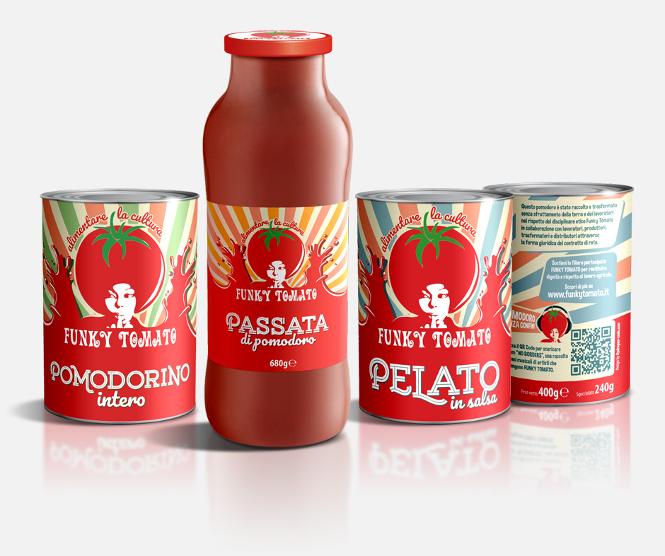
Create a strong strategic and visual identity on the Brand to define a clear positioning in the Markets. Define the new graphic design of Funky Tomato food labels in all the products: tin cans and glass bottles.
Funky Tomato is POP in its way of thinking and acting. It has a unique approach to the supply chain and those who work there, focused on protecting the product, who produces it and who consumes it. It is a non-conventional Brand that represents a reference on conscious nutrition, seen in its entirety with the energy, fun and sense of belonging of those are working in.
These reasons and the strong link between Funky Tomato and the territorial music culture makes it a POPArt icon that we have transferred to the Brand image.
The funk and jazz sounds of the ’60s and’ 70s were an important inspiration for the design, based on iconographic elements of pop culture, from posters to covers of vintage records.
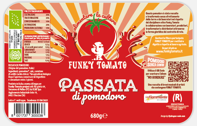
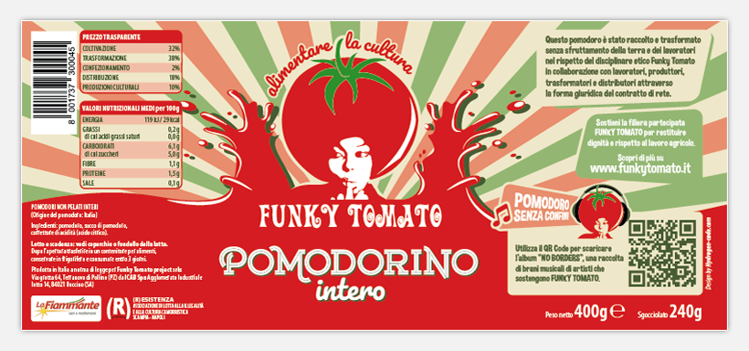
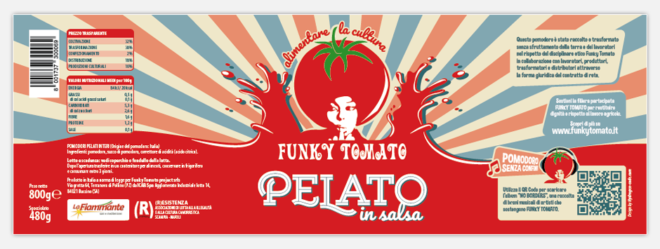
The great cultural and ethical value in the production and the respect for the land and its workers, are expressed by the pay-off “Food for Culture”, placed above the logo on the label.
To strengthen the link between the Company and music, each label has been equipped with a QRCode that refers to a page of the company website where you can listen and download the album “No Borders”, a playlist of music by artists who support the Funky Tomato project.
Strategic & Creative Consulting
Brand Identity
Graphic Design
Packaging Design